Simple Things That Can Make or Break Your Communication Design
Introduction: Grabbing Attention in a Digital World
In a world bombarded with information and distractions, effective communication design is the key to cutting through the noise and capturing your audience’s attention. Whether you’re a marketer, a graphic designer, or a business owner, understanding the simple yet powerful elements that can make or break your communication design is essential. In this blog post, we will explore some of these elements that can significantly influence the success of your communication design.
1- Clear and Concise Messaging
One of the fundamental aspects of communication design is delivering a clear and concise message. Your design should aim to communicate the intended message to the audience without causing any confusion. Cutting through the clutter and distilling your message to its core helps in creating a design that leaves a long-lasting impact. Effective use of headlines, subheadings, and bullet points also helps to break down complex information into easily digestible chunks.

2- Visual Hierarchy: Guide the Eye, Rule the Design
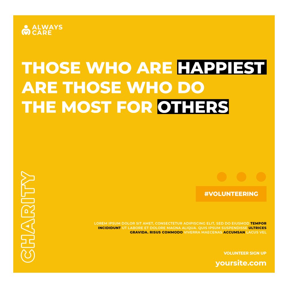
Visual hierarchy plays a vital role in guiding the viewer’s attention and prioritizing the content within a design. Establishing a clear visual hierarchy ensures that important information stands out and grabs the viewer’s attention first. Think of it as the traffic cop directing your audience’s attention. Utilize the size, color, contrast, and spacing of your design elements to create a captivating visual hierarchy. By strategically emphasizing the most important information, you ensure that your message stands out amidst the visual noise, grabbing the viewer’s attention and making a lasting impression.


3- Consistent Branding: Be Memorable, Be Recognized
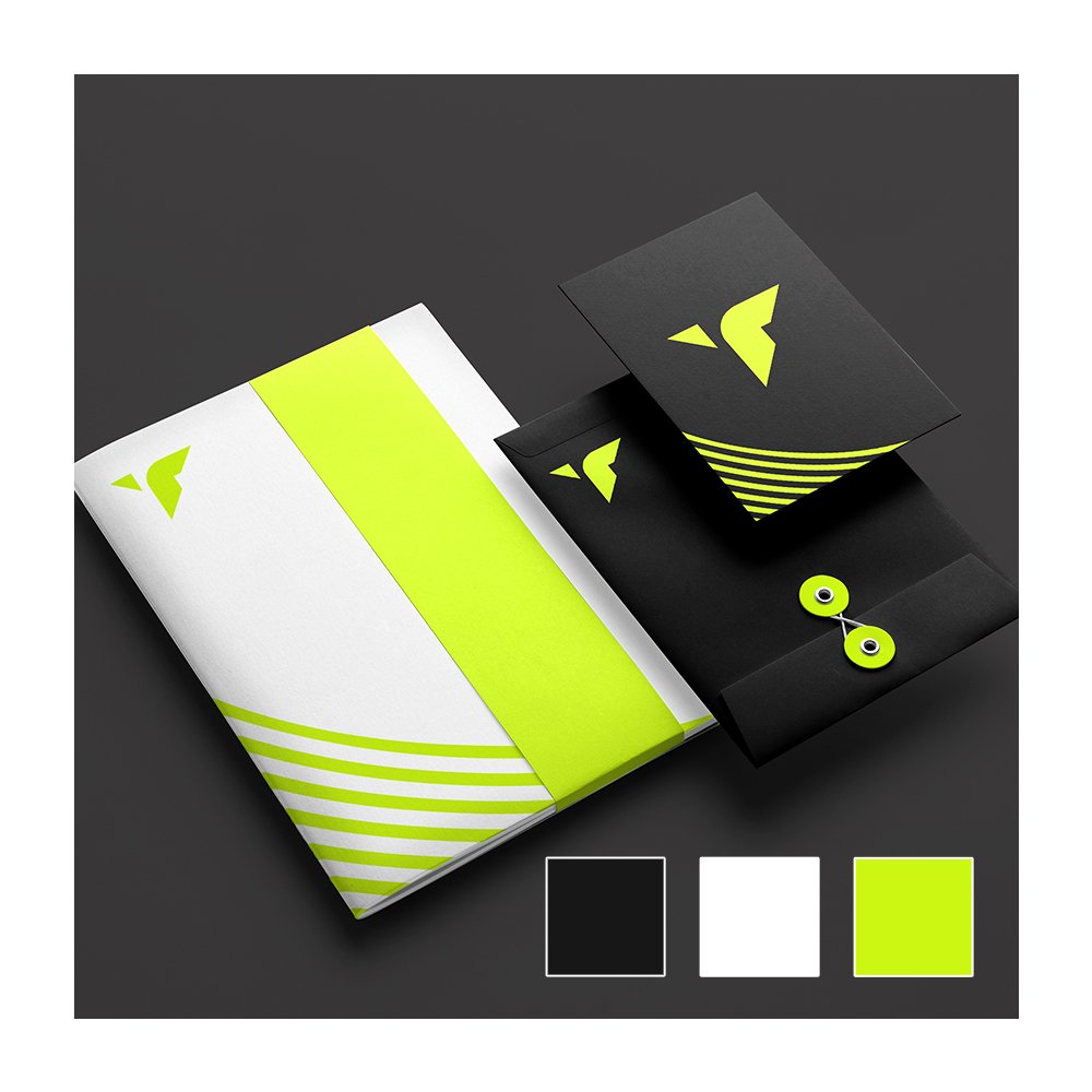
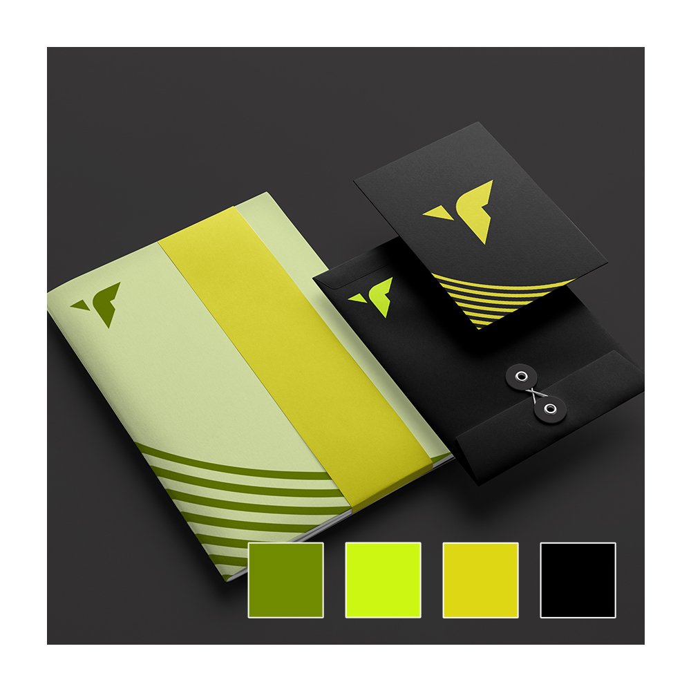
Consistency in branding is crucial for establishing a strong identity and recognition. Your communication design should align with your brand’s visual language, including colors, fonts, and overall aesthetics. Consistent branding creates a sense of familiarity and builds trust with the audience. Make sure to use your brand’s logo and other visual assets consistently across different communication channels to maintain a cohesive and recognizable brand image.
4- Typography: The Art of Words
Typography also plays a significant role in communication design. The choice of fonts can evoke specific emotions and set the tone for your message. Select fonts that align with the overall style and purpose of your design. Ensure that the typography is legible and easy to read, especially for longer passages of text. Maintain proper spacing between lines, paragraphs, and headings to enhance readability. Experiment with font sizes, weights, and styles to create visual interest and emphasize important elements within your design.


5- Color Palette: A language of sensation to set perceptions
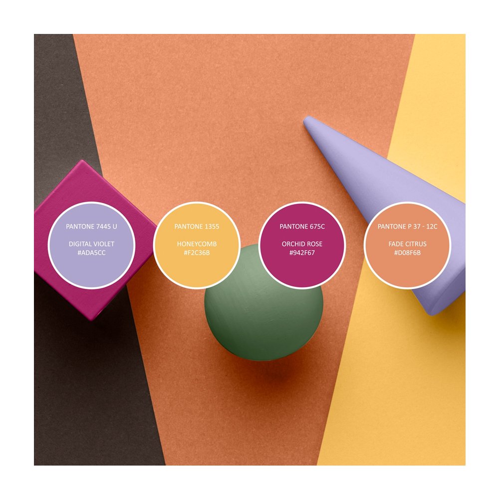
Colors have the incredible ability to evoke emotions and convey messages without uttering a word. Choosing the right color palette is crucial for effective communication design. Consider the psychological effects of different colors and select hues that resonate with your message and target audience. Create a harmonious color scheme that enhances the visual appeal of your design and conveys the desired mood or atmosphere. Use contrasting colors strategically to draw attention to specific elements or to create visual impact.

6- Negative Space: Less is More
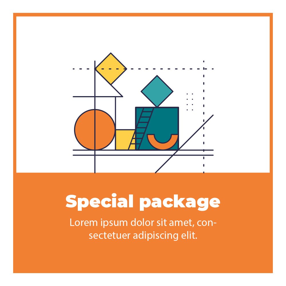
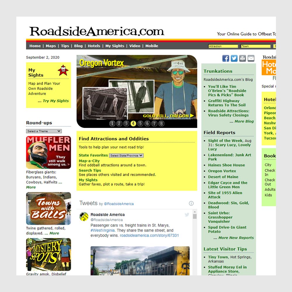
In a world filled with noise, negative space is a breath of fresh air. It is not merely an “empty” space but an essential design element that helps to create balance, focus, and visual clarity. Embrace negative space in your communication design to provide breathing room for the content and allow it to stand out. A cluttered design with limited negative space can make it difficult for the viewer to focus on the essential elements and understand the message.
7- Consistent Alignment
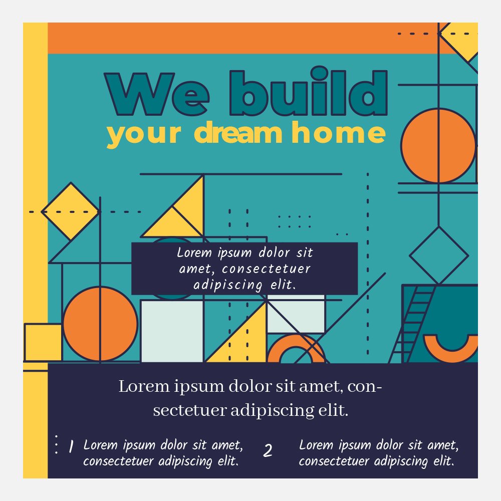
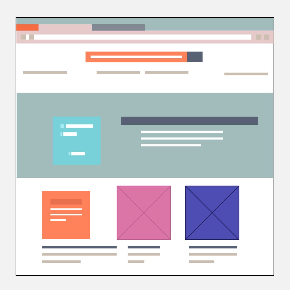
Maintaining consistent alignment is crucial for achieving a polished and professional communication design. Aligning elements such as text, images, and graphics creates visual harmony and improves readability. Choose between left, right, center, or justified alignment and stick with it. Inconsistent alignment can create chaos and confusion, leaving your audience scratching their heads instead of engaging with your message.
8- User-Friendly Layout
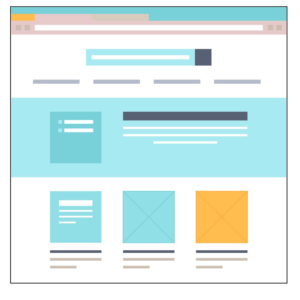
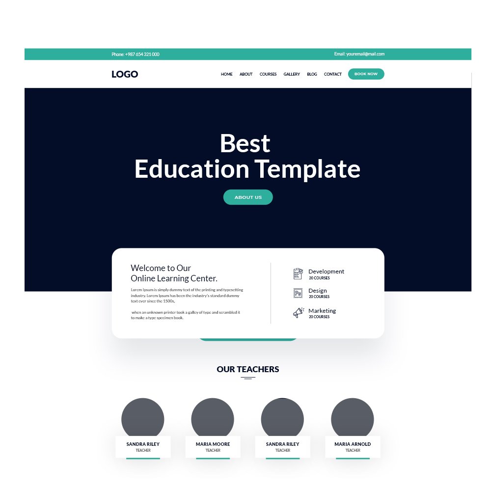
A well-designed layout can significantly impact the user experience of your communication design. Consider the flow of information and how the viewer’s eye will naturally move across the design. Organize the content logically and intuitively, guiding the viewer from one element to another seamlessly. Pay attention to spacing, grouping related elements together, and providing clear visual cues to help the viewer navigate the design effortlessly.
Conclusion: Mastering the Art of Communication Design
In the world of communication design, attention to detail is paramount. By considering the simple factors outlined in this blog post, you can significantly enhance the effectiveness of your design and convey your message more powerfully. From clear and concise messaging to consistent branding, typography, color, negative space, alignment, and layout, each element contributes to the overall impact of your communication design. By mastering these simple yet critical factors, you can create visually compelling designs that engage your audience and leave a lasting impression.

