Logo

Drop a line to be in touch...

Contact Info

2nd Floor, 1/23 Rajni Khand, Sharda Nagar, Lucknow, UP (226002), India.

+ 91 811 5128 777
+ 91 522-4349733

info@xvscreations.com xvscreations@gmail.com

Follow Us

June 16, 2023 by Sanjeev 0 Comments

Simple Things That Can Make or Break Your Communication Design

Introduction: Grabbing Attention in a Digital World

In a world bombarded with information and distractions, effective communication design is the key to cutting through the noise and capturing your audience’s attention. Whether you’re a marketer, a graphic designer, or a business owner, understanding the simple yet powerful elements that can make or break your communication design is essential. In this blog post, we will explore some of these elements that can significantly influence the success of your communication design.

1- Clear and Concise Messaging

One of the fundamental aspects of communication design is delivering a clear and concise message. Your design should aim to communicate the intended message to the audience without causing any confusion. Cutting through the clutter and distilling your message to its core helps in creating a design that leaves a long-lasting impact. Effective use of headlines, subheadings, and bullet points also helps to break down complex information into easily digestible chunks.

2- Visual Hierarchy: Guide the Eye, Rule the Design

Visual hierarchy plays a vital role in guiding the viewer’s attention and prioritizing the content within a design. Establishing a clear visual hierarchy ensures that important information stands out and grabs the viewer’s attention first. Think of it as the traffic cop directing your audience’s attention. Utilize the size, color, contrast, and spacing of your design elements to create a captivating visual hierarchy. By strategically emphasizing the most important information, you ensure that your message stands out amidst the visual noise, grabbing the viewer’s attention and making a lasting impression.

3- Consistent Branding: Be Memorable, Be Recognized

Consistency in branding is crucial for establishing a strong identity and recognition. Your communication design should align with your brand’s visual language, including colors, fonts, and overall aesthetics. Consistent branding creates a sense of familiarity and builds trust with the audience. Make sure to use your brand’s logo and other visual assets consistently across different communication channels to maintain a cohesive and recognizable brand image.

4- Typography: The Art of Words

Typography also plays a significant role in communication design. The choice of fonts can evoke specific emotions and set the tone for your message. Select fonts that align with the overall style and purpose of your design. Ensure that the typography is legible and easy to read, especially for longer passages of text. Maintain proper spacing between lines, paragraphs, and headings to enhance readability. Experiment with font sizes, weights, and styles to create visual interest and emphasize important elements within your design.

5- Color Palette: A language of sensation to set perceptions

Colors have the incredible ability to evoke emotions and convey messages without uttering a word. Choosing the right color palette is crucial for effective communication design. Consider the psychological effects of different colors and select hues that resonate with your message and target audience. Create a harmonious color scheme that enhances the visual appeal of your design and conveys the desired mood or atmosphere. Use contrasting colors strategically to draw attention to specific elements or to create visual impact.

6- Negative Space: Less is More

In a world filled with noise, negative space is a breath of fresh air. It is not merely an “empty” space but an essential design element that helps to create balance, focus, and visual clarity. Embrace negative space in your communication design to provide breathing room for the content and allow it to stand out. A cluttered design with limited negative space can make it difficult for the viewer to focus on the essential elements and understand the message.

7- Consistent Alignment

Maintaining consistent alignment is crucial for achieving a polished and professional communication design. Aligning elements such as text, images, and graphics creates visual harmony and improves readability. Choose between left, right, center, or justified alignment and stick with it. Inconsistent alignment can create chaos and confusion, leaving your audience scratching their heads instead of engaging with your message.

8- User-Friendly Layout

A well-designed layout can significantly impact the user experience of your communication design. Consider the flow of information and how the viewer’s eye will naturally move across the design. Organize the content logically and intuitively, guiding the viewer from one element to another seamlessly. Pay attention to spacing, grouping related elements together, and providing clear visual cues to help the viewer navigate the design effortlessly.

Conclusion: Mastering the Art of Communication Design

In the world of communication design, attention to detail is paramount. By considering the simple factors outlined in this blog post, you can significantly enhance the effectiveness of your design and convey your message more powerfully. From clear and concise messaging to consistent branding, typography, color, negative space, alignment, and layout, each element contributes to the overall impact of your communication design. By mastering these simple yet critical factors, you can create visually compelling designs that engage your audience and leave a lasting impression.

December 8, 2022 by Niharika Ranjan 0 Comments

Why should you consider simplifying your design?

“Make it simple, but significant.”

Putting too much food on our plates leads to overeating. In the same way, a lot of elements create havoc on the canvas….

As designers, we design to attract, inspire, create desires and motivate people. For any designer, it is really important to understand the story behind any idea, campaign or product. And then portraying it in the simplest and shortest way possible.

Consumers are served with a humongous variety of content, by simplifying your content you will leave a longer impact on your audience. Simple may seem easy, but you still need to be strategic. You can’t simply delete vital information to make room for white space. Think about the information your users require and how to provide it in the smallest possible space. 

Let's see what all we should keep in mind….

  • Well-presented Content is a charmer

A well-tucked-in black shirt looks more appealing than an expensive oversized flower print t-shirt. In the same way, a well-presented creative leaves a more powerful impact on the audience.


  • Highlighting the moral of the story

It is very difficult to convey an hour-long movie on a single creative or banner, so don’t even try that. It is better that you highlight the moral of the story which will not only give shape to us your content but will also help you to focus on the main objective.


  • Let your design “breathe”

The best and the simplest way to create a proper design is by following the “Z-pattern” of designing which follows a line placing all the objects at the correct focal level as well as giving adequate breathing space. The 80-20 rule is an excellent place to start when thinking about making changes to a design.


  • Build Curiosity

The end goal of every brand is to create awareness. People tend to remember weird, quirky stuff, so go for that…. Instead of telling your audience everything, try to arouse a question within them. 


  • It goes better with Working memory

It is quite difficult to remember a lot of details while a short, crispy and to-the-point text is easy to remember. It allows you to focus your attention, resist distractions and make decisions. 

A design that’s too complicated or “too designed” can come in the way of what you want to communicate to the audience. Make sure that every element of your design should emphasize on getting to the desired destination. Strip out all that extra element that can come in between you and your audience. Go for a clean, informative and easy-to-understand design. Avoid the clutter-heavy design for a small screen as it might ruin the user experience in nanoseconds.

Advantages of a simple design

  • Audiences don’t have time to waste on complexity 

No one is going to wait and keep on looking at your design trying to unlock the complexity in your design. Making it user-friendly should be the ultimate goal of any designer. Highlighting important elements, trying to communicate through your design and removing the unnecessary cluttering elements is how you can simplify your design.


  • Simplicity can be strategic too

It’s a myth that simple designs are easy to make. Well, as a matter of fact, simple designing can be more difficult than a complex design. Creating a simple design that is appealing as well as self-explanatory is the sign of a great designer


  • A great way of communication

Does communication simply mean exchanging information through different means in that case what is better than simple design? This indeed has the best of both worlds: good looks + engaging short text. 


Focus on these golden questions

While designing a simplistic design ask these golden questions from your inner designer.

  1. How easily can you understand what the design is trying to depict?
  2. Is this simple or incomplete?
  3. Is my subject appealing or not?

If you are able to answer these three questions, you are good to go.

Keep this in your mind!!

In the end, users won’t consider how innovative and impressive your design is if they can’t find what they’re looking for. They simply want to know why things aren’t “where they should be.” And when you want them to convert, that’s really not the ideal attitude.

Going deep into your user’s mind and using that understanding to design gives you a further vision to eliminate inconsequential elements and closes the gap between the user’s goals and the major means to achieve those goals is how you achieve simplicity in design. It’s not just about using minimal colors or including whitespace. To put it in another way, achieving simplicity in design helps you stay tuned into your users’ needs, gives them the impression that you are listening to them, and enables you to efficiently focus on solutions that are most suited to solving the particular issue you are trying to solve.

FAQ

Why simplicity is important in design?

Creative design agency is a company that offers creative designing solutions for you branding, marketing and advertising needs through their graphics and other tools.

How do you simplify the design process?

You could do so by following these processes:
1- Mind mapping
2- Feedback
3- Communicable

Is simplicity a good design principle?

Simplicity is definitely a good design principle as it takes into account the user’s objectives and offers the most straightforward path to achieving those objectives.

Why is visual simplicity important?

The visual simplicity of an image is a characteristic we seem to quickly extract. Simple designs tend to be more aesthetically pleasing. Simplicity is more accessible as well as more impactful.

How targeted communication designs are more effective

What are communication designs? 

More than just designs, communication designs are the way to deliver messages to the viewer while making favorable impacts. Not limited to the traditional platforms of media, communication designs also encourage to development of new mediums and oblige the creative use of existing media platforms. 

Most of the time, communication designs are co-related with graphics design because of the overlapping skillset involved in both of them. The key difference is the way it delivers the message that it should be the design itself doing most of the work, communicating, and making an impact on the viewer.  

Targeted communication designs 

Dynamics of business rules that there is always more than one party involved in conducting any business and this number only tends to increase. On any good day, certain things have to be communicated among the people working and interacting. 

It’s highly unlikely for a single design to be effective across all kinds of parties involved. The best way to move forward is to have a targeted communication design for each category. The information required among fellow colleagues would be different from what needs to be communicated to your customers. 

How to make your communication design’s targeted

It involves a process but mostly depends upon dedicating proper attention to each category. 

Deciding your audience 

The trick here is that identifying a target audience in B2B can be a bit more difficult than it is in B2C.

When it comes to B2C, the purchase decision-making process is usually much simpler. Typically, you’ll only have one person (your customer) who decides on whether they want to buy or not. Because of this, you can dive deep into their individual pain points and what it is they want when you’re identifying your target customer, then tailor all of your marketing efforts accordingly.

Unfortunately, it’s not always that simple on the B2B side…

Major purchases often need to be considered by more than just one person.

Instead of just digging into what your one, ideal, individual customer is looking for — you need to think bigger.

Choose the platform

Whether you’re going for digital media or print media, choosing where it will have a higher impact is crucial. It’s availability and feasibility is also important. How quickly you can ramp up your promotions on each platform varies significantly. 

A new Pew Research Center study shows that Facebook and YouTube continue to be the most widely used online platforms among U.S. adults. Roughly three-quarters of Facebook users visit the site daily. Snapchat and Instagram are especially popular among 18- and 24-year-olds. 

Draw up the content 

You would need an audit to determine your current performance and understand what works and what doesn’t for the audience you are targeting. This knowledge will then help you plan your targeted communication designs.

While carrying out an audit, some details to check include:

  • Top-performing content
  • Low-performing content
  • Content publishing frequency
  • Ranking keywords

The more you understand your current performance – and the reasons behind your performance, whether good or bad – the more knowledge you’ll have to help you develop future targeted communication designs.

Design, what’s important 

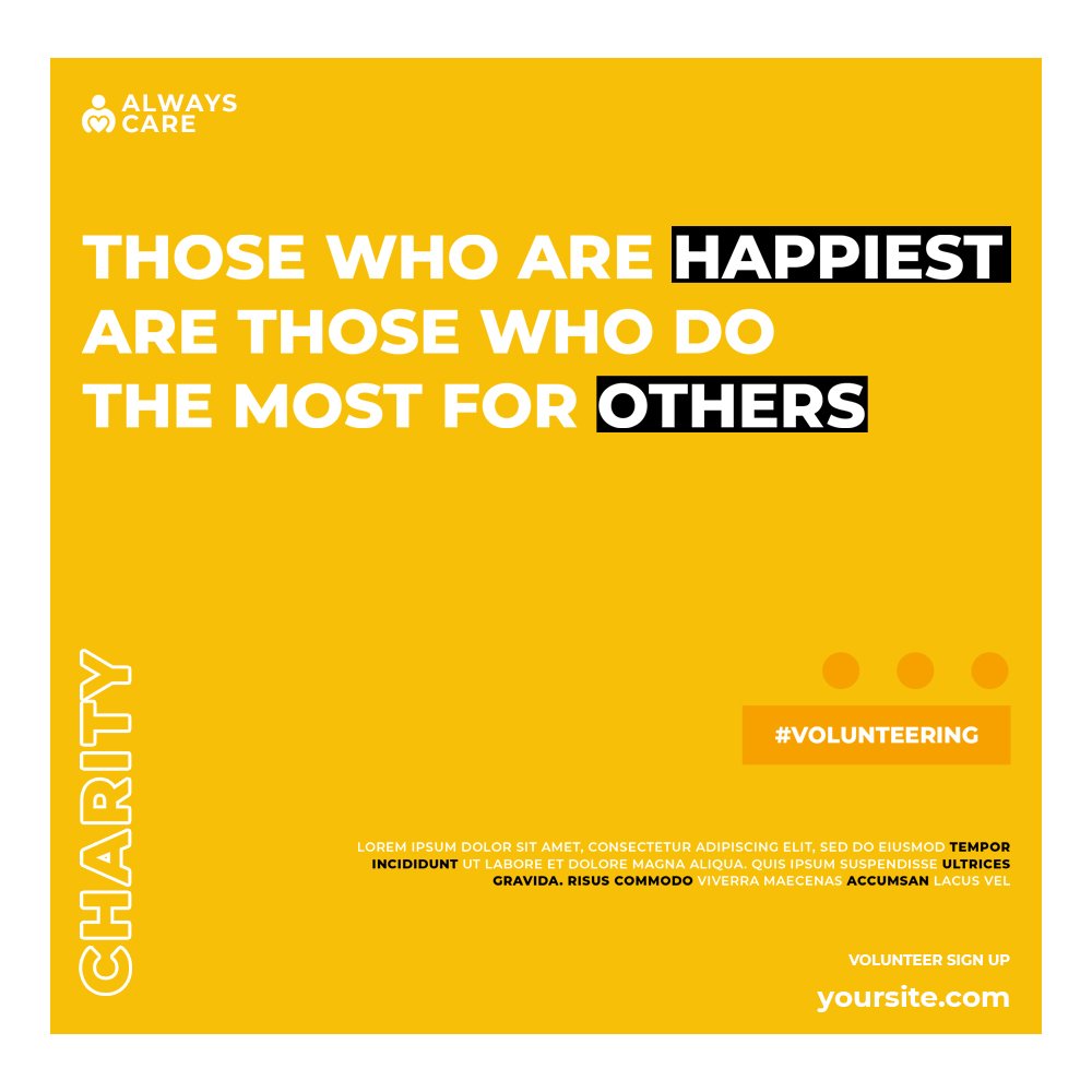
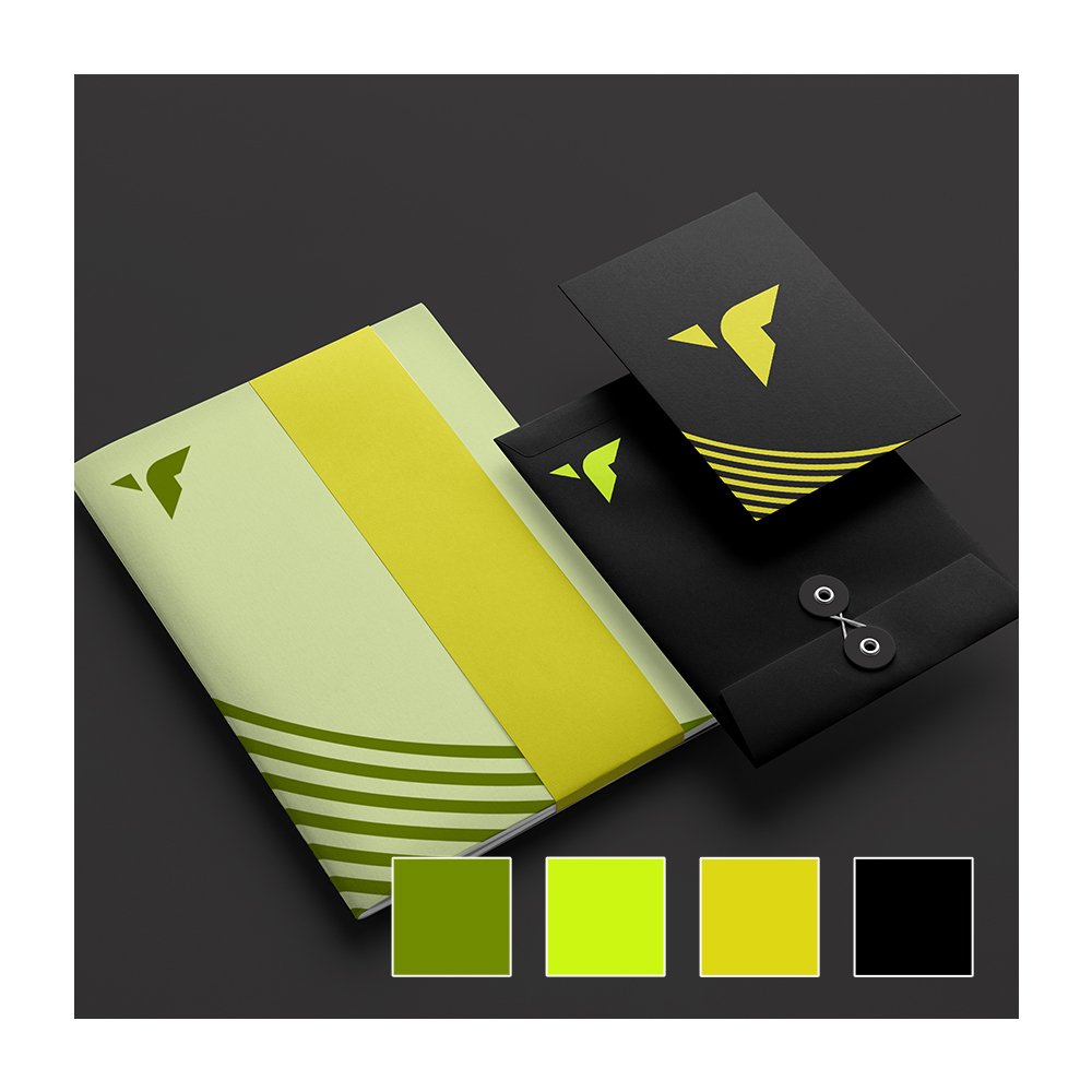
In this whole process, this might be the most important. In communications design, what you design is the message itself. Your creativity turns what needs to be conveyed. 

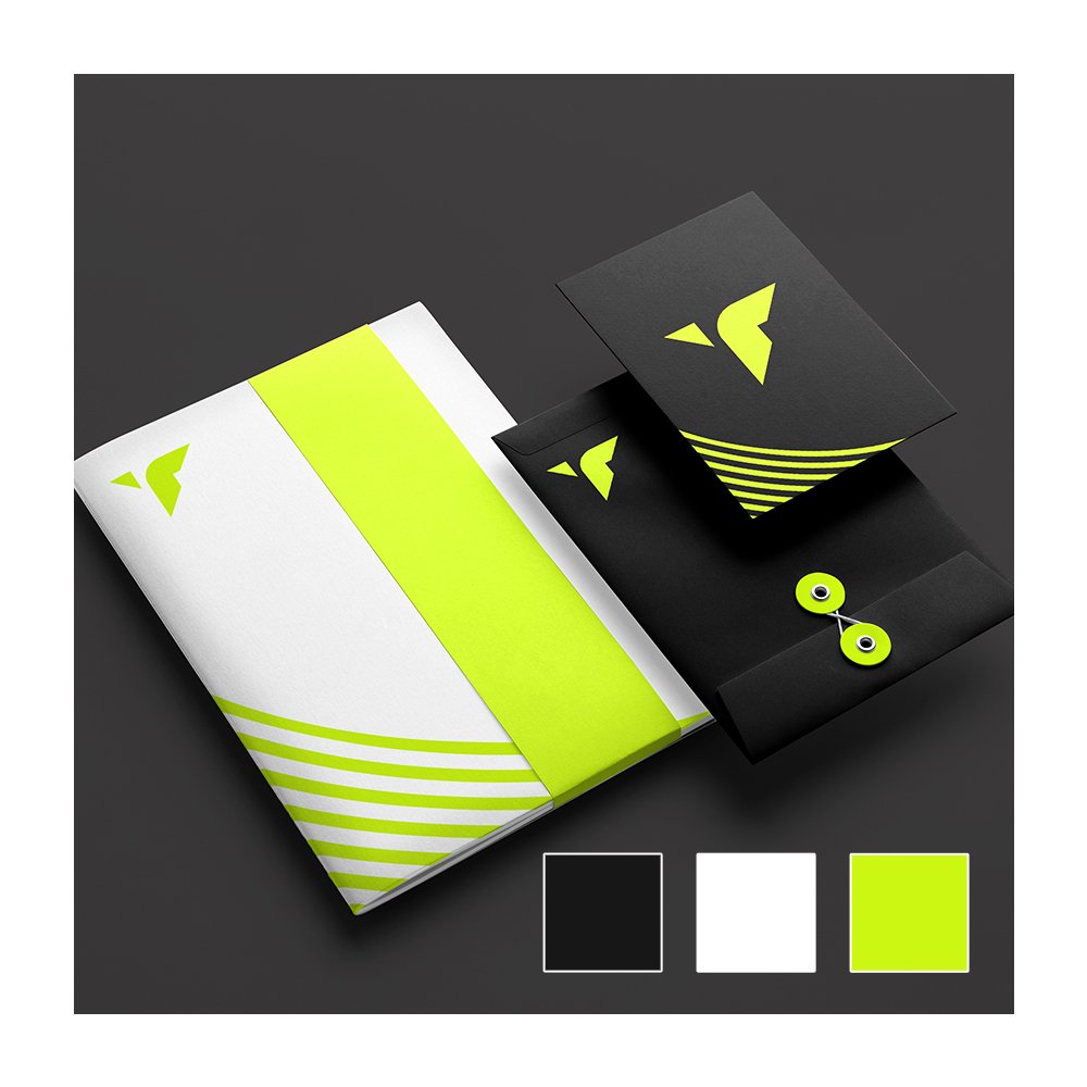
Next, get your magpie hat on and start collecting everything that catches your eye. Business cards, brochures, merchandise, the lot. If you like it, pick it up and use it to inform your own marketing material designs. Setting up a Pinterest board is also a great idea if you want to create a virtual scrapbook of inspiration.

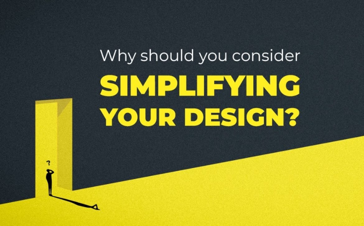
People have very short attention spans these days, so your information needs to be scannable and easy to digest. To achieve this, you need to create a layout with bold headers, good quality graphics, and short, bitesize paragraphs. Don’t be too wordy or try to cram too much in.

Publish it effectively 

It happens mostly after dedicating much of the time and effort on various previous steps publishing is just rushed. Posting on social media, taking it to live, or sending the deliverable to its destination is crucial. Few people are obligated but not all of them will see at any given time. Figuring out the time, supporting content and easiness will help you make it effective. 

Conclusion 

Putting all things together what makes targeted communication designs effective is the customized message and its delivery. Dedicating proper time and effort will help you achieve it. Understanding the segment of your audience will have a positive effect. When things are designed in the language they understand, it gets easier to connect.